Project Showcase: Ruby, Tinto de Verano
In March, a friend of mine came to me—whom at the time, was studying in Madrid—to join her team for their year-end thesis as a designer.
I was thrilled, and said yes—even though it was pro bono (which I don't normally do)!
Pro bono work is usually a good idea if you're looking to build up a portfolio, or if you're looking a way to be of service—a helping hand to different communities. It also means that the work is delivered voluntarily and without payment—rather it brings you positive awareness and allow you to build a portfolio, and earn experience.
The negative side of pro bono work is that it can be overrated and that designers should get paid. Most companies take advantage of it, and designers have to be careful. Nonetheless, I knew I had to do this because It was something I've always wanted to do—create and design a brand identity for a wine company.
Introducing Ruby, Tinto de Verano
Tinto de Verano is a summer red wine similar to sangria, and is quite popular in Spain. It is usually mixed with one part red wine, and one part of soda (carbonated drinks). Ruby is a new product idea as an ecological premium Tinto de Verano with high quality wine which provides a new experience of a refreshing drink.
It is produced with high-quality wine, and is an organic certified. The vineyard works in an ecological way, which means there are no use of artificial chemicals. Sustainability plays a big role, too.
The project spoke to me as it is definitely cool, refreshing, high-end and a lifestyle beverage with a taste of Spain—not limited to summer but for the entire year. It's chic, stylish, and a must-have drink.
Design Process
When Ruby was introduced, I got excited for my trip to Barcelona coming up in July (which has already passed). I've imagined Spain as a lively culture of arts, architect, food, and everything else in between. I planned to write about Ruby after the trip—only to see if my gut was right about Spain. And, it was. I love everything about the city, and I plan to go back to explore other cities like Madrid, Iziba, and Seville.
Before visiting Barcelona, I was immensely inspired with typography that had a natural vibe—like, handwritten and sans-serif fonts. In addition, when I dreamt of Spain, I imagined the entire city filled with bright, and beautiful florals.
Below are the 4 concepts
First option (left) focuses on the shape of an actual ruby—using lines, and colours to enhance the shape. Whereas second option (right) is a script font—to symbolize the organic values and nature of the winery. Plus, it feels more personal.

Option 1

Option 2
Before I present the third and fourth option, I like to throw a surprise by presenting bold, and innovative concepts. It's my secret weapon.
Option three (left) is inspired by Vogue and the vivid colours of Spain. I played with the typeface by removing some of the lines, and adding floral to compliment the typography. While option four (right) uses the florals while using a versatile font. The idea was to use patterns behind the font while keeping the name.

Option 3

Option 4
The winner? Option 2
A Client’s point of view...
[Angelika Tarasiuk, project lead] I reached out to Sara for help at first to get a general second option on our creative process. I have been following Sara’s work over the course of the last few years and have immense respect for her approach to design.
As both a friend and a confidant, her approach to our final project was completely professional. She immediately asked us open ended questions to get my team and I to think about the direction we would like to take with the brand. It led us to think beyond this initial new product launch of Ruby. We came up with the concept of an umbrella brand so that we could take into account the future state of the food and beverage industry.
The result was seamless. We opted to go with Option 2 of Sara’s design and was the foundation of all our online and offline creative campaign work. Without her guidance, we would have been left with an amazing project idea but without a clear direction of how to tie it all tougher.
As a marketing and sales professional, I truly believe that branding is something not to take lightly. It is the foundation of the values you as an organization strive to achieve. Regardless of the scale and size of the initiative, I recommend a brand specialist to always take part in the marketing strategy formulation so that as the product or service grows, so does the brand evolution.
It’s been three months since we completed the thesis project and we are keeping the marketing plan in mind as we look for prospective investors to take the idea into the execution stage. Our vision is to bring Ruby to markets across the world as it is something that we are sure once an individual’s tries, they will want more!
As my team and I like to stay “Summer is all year round”
The team also collaborated with another designer, Nic Bugus to create a creative campaign—that was focused on guerrilla marketing tactics to create demand with end consumers.
The team has described it,
To create buzz in the targeted cities we will spray the pavement in an overnight action at the busiest places with the phrase: "The summer is back" (in April) and "Summer” is all year" (in October). In addition, there is a QR code to trigger call to action. When the code is scanned it will lead to [Ruby's] main website and will provide the visitor with the necessary information about the product.
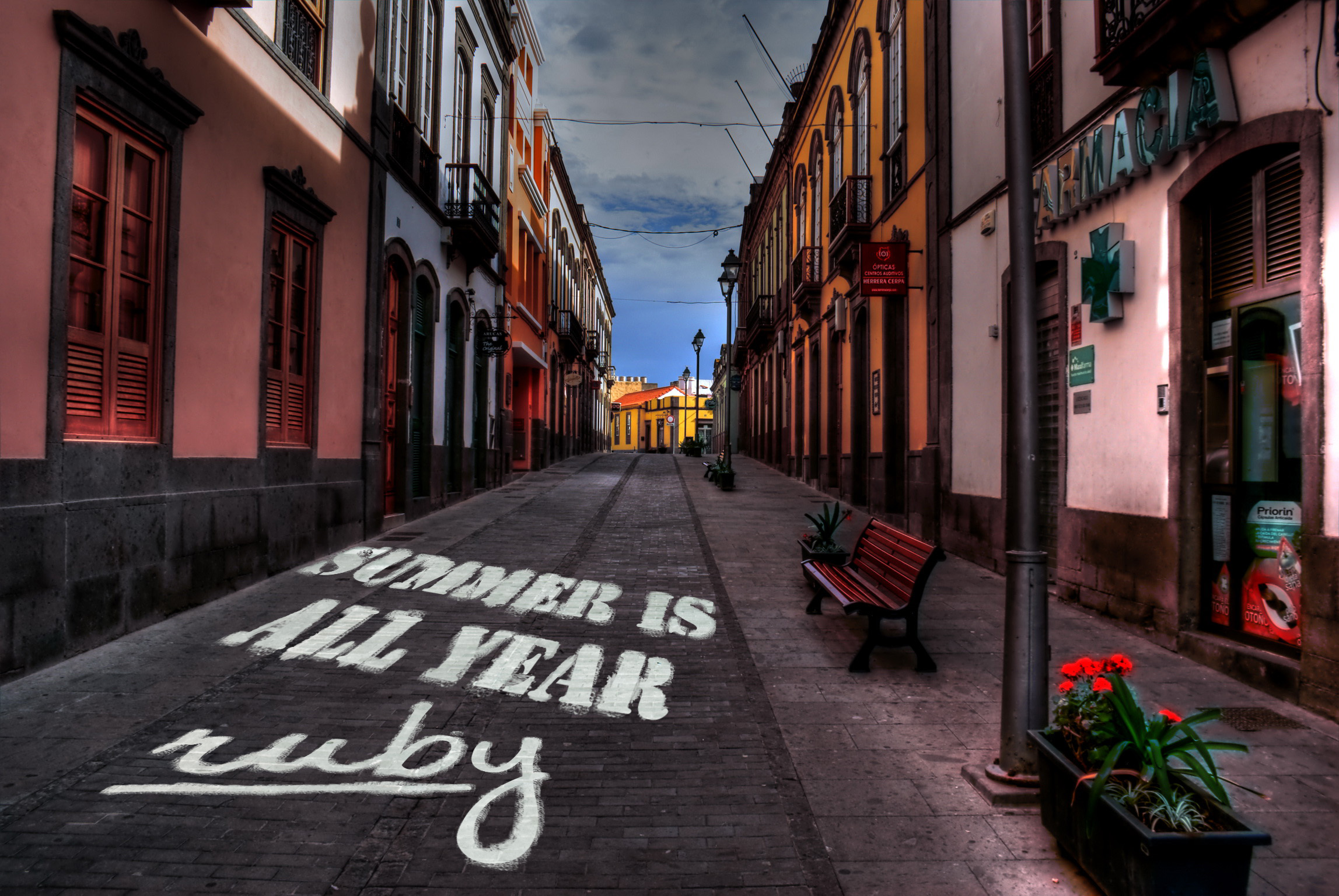
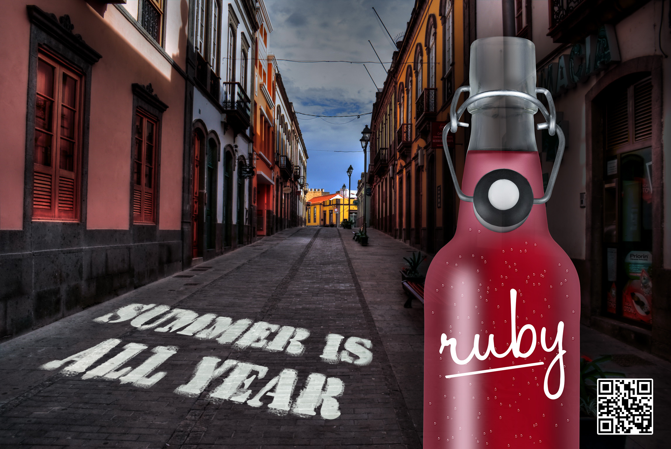

Creative Campaign by Nic Bugus | Logo Design by Sara Borean